
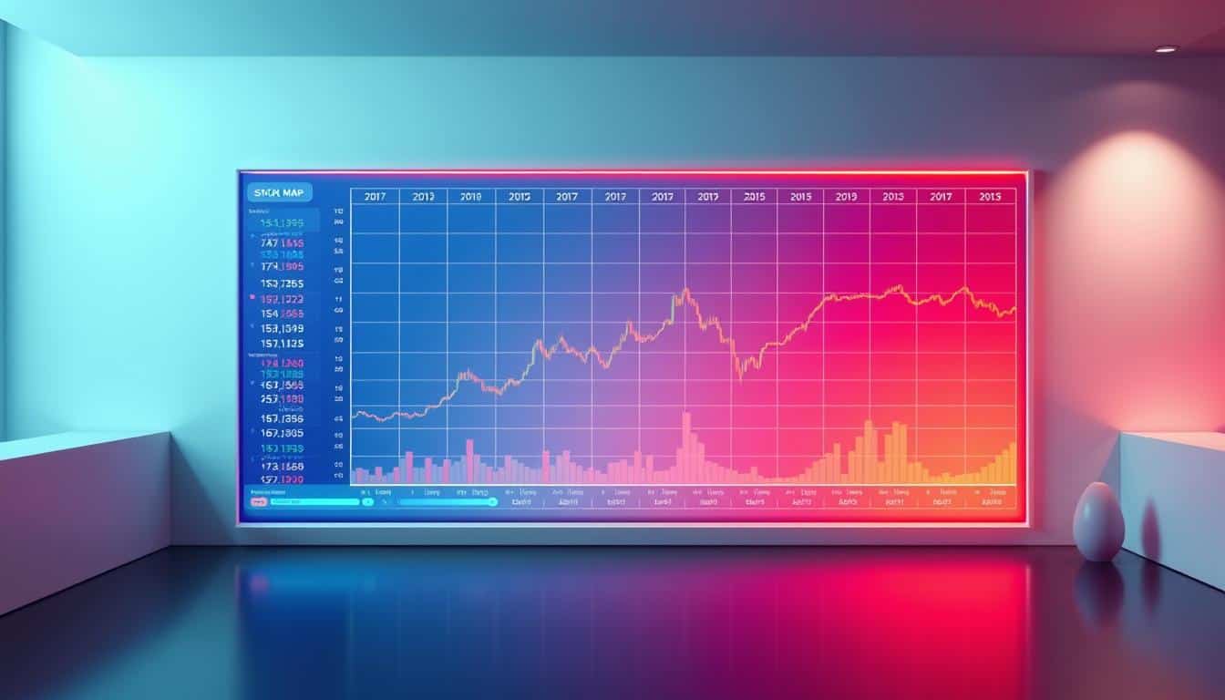
12 Aug Stock Heat Map Analysis: Graph, Statistics & Prediction
Surprising fact: modern order-flow tools can show liquidity changes in sub-millisecond slices, revealing where billions shift before a single price move.
I use a graph-first approach to connect visual cues with real trading information. Bookmap’s Nasdaq TotalView feed and Finviz sector views give me live context so I know which areas of the market are active, not just noisy.
This matters: seeing liquidity bands and where market order volume hits best bid/ask changes how you act that day.
The goal here is practical. I’ll show charts and order-flow examples, reference tools I use on desktop and an iOS app when I’m away, and tie statistics to clear predictions for short-term performance.
Key Takeaways
- Visualize liquidity and volume first; price follows context.
- Use Bookmap for order flow, Finviz for sector snapshots, and a mobile tool for on-the-go checks.
- Focus on actionable signals like absorption at liquidity bands.
- Predictions grounded in observable data beat guesses.
- Practical setup and time-compressed views reduce noise for traders and investors.
Why a Stock Heat Map Matters for Today’s U.S. Market
When markets move fast, a visual grid often tells me where capital is gathering before prices react. I use that first look to prioritize where to dig for order-flow and volume clues.
Evidence-based sources back this workflow. Finviz’s S&P 500 view gives sector performance at a glance. Bookmap surfaces liquidity bands that traditional price charts miss. An iOS heatmap app extends coverage to 18 countries and 35 industry ranks, which helps spot cross-asset trends.
Practical guide: start wide with sector tiles, then narrow to names showing concentrated volume. For intraday trading I focus on where volume hits clear liquidity zones on the order book, not on headlines.
- Scan sectors for leading performance and trends.
- Drill into names with matching behavior on the order book.
- Use fast-updating tools so information stays actionable through the day.
| Tool | Primary Strength | Use Case | Coverage |
|---|---|---|---|
| Finviz S&P 500 Map | Sector snapshot | Quick performance check | U.S. equities + crypto grid |
| Bookmap | Liquidity visualization | Order-flow validation | Depth-of-market feeds |
| iOS heatmap app | Multi-asset alerts | Cross-asset correlation checks | 18 countries, 35 industries |
From Price Charts to Order Flow: How Stock Heat Maps Visualize the Market
Colors and lingering intensity tell a story faster than a candle ever will; I let that story lead me.
Graph fundamentals: on a Bookmap-style view, color intensity represents limit orders that persist over time. Bright zones—often red or bright—mark thick liquidity. Those zones show where price may pause or reverse.
The best bid and best ask lines trace where the book is thickening or thinning. Bubbles encode market order volume: green for buy-dominant, red for sell-dominant. Unlimited zoom helps me inspect microstructure down to the second when entries matter.
Why this matters vs. candlesticks: candlestick charts summarize open-high-low-close. They do not expose order placement or intent. The order book heatmap reveals intent—stacked offers above can act as resistance; layered bids below can act as support—well before a candle confirms anything.
Sector performance views tell me where strength shows today. Depth-of-market heatmaps tell me where price will likely react next. Use both lenses.
“My rule: let the heatmap prove it—if price tests a hot zone without slippage and volume confirms, that’s my green light.”
- I read color as liquidity depth; brighter bands mean thicker book levels.
- I watch bid/ask glide into bright zones to spot absorption.
- I zoom out for context, then in to time entries for fast names; that’s key for day trading.
| View | Primary Signal | Use Case |
|---|---|---|
| Order-book heatmap | Persistent liquidity bands, bubbles | Entry timing, absorption detection |
| Candlestick chart | OHLC summary, trend bars | Context, confirmation, multi-timeframe analysis |
| Sector performance map | Relative strength by industry | Scanning leaders and allocation decisions |
Practical Guide: How to Use a Stock Heat Map for Better Trading Decisions
Start with a quick sector scan, then narrow to names where order flow and liquidity line up. This keeps the work efficient and focused. I use a fast stock screener or Finviz tiles to make a short watchlist.
Step-by-step workflow
- Screen fast: use a sector view or stock screener to find leaders that match broad market direction.
- Mark rails: open a heatmap-style book (Bookmap is my go-to) and note the brightest liquidity bands above and below price.
- Watch reaction: wait for a test. If market orders meet and stall, that’s absorption. If they slice through, liquidity is thin.
- Plan entries/exits: enter when flow confirms and exit at the next opposing band. Add a time stop if the behavior is slow.
Risk controls, freshness, and privacy
Respect real-time data. If your feed lags, treat reads as stale and skip the trade. I log screenshots and timestamps to audit behavior over time.
Platform hygiene: review each tool’s privacy policy and mobile permissions. The iOS app I use syncs with Yahoo Finance and posts AI news, but its privacy policy notes non-identifying tracking for some features.
“Let the book confirm headlines; headlines alone don’t time entries.”
Top Stock Heat Map Tools and Dashboards to Try Now
Top tools surface real-time depth so I can tell if an impulse has fuel behind it. I pick platforms that show liquidity, volume, and replay so I can study execution, not guesswork.
Bookmap is my go-to for real-time liquidity with Nasdaq TotalView. It shows market order volume bubbles, supports historical order-book replay, and links with brokers like Interactive Brokers and TradeStation.
Finviz offers the S&P 500 map and a new Crypto Map. Use it for quick price-performance scans, sector rotation, and premium backtesting when you need context fast.
Mobile app coverage matters. The iOS app covers 19 countries, 35 industry rankings, 10 crypto categories, futures and indexes, Yahoo Finance deep links, AI summaries, and includes a privacy policy you should review. Version 2.7.0 shipped June 28, 2025.
- Selection criteria I use: real-time data, replay, depth quality, customization, and integrations.
- Start with a market heatmap for context, then drill to Bookmap for execution reads.
| Tool | Primary Feature | Best For |
|---|---|---|
| Bookmap | Depth-of-book, volume bubbles, replay | Execution-level reads |
| Finviz | S&P 500 overview, crypto map | Sector scanning |
| iOS heatmap app | Global coverage, Yahoo Finance links | Mobile monitoring |
“Good tools show where liquidity sits; then you decide if the move is tradeable.”
Statistics That Matter: Turning Heatmaps into Actionable Signals
Clear metrics make the difference between a guess and a trade. I rely on a tight set of numbers to turn a visual read into a rule I can test.
Core metrics I watch:
Core metrics: liquidity bands, best bid/ask, market order volume, and absorption
I mark persistent bright bands as provisional support and resistance. Those liquidity bands often predict where price will hesitate.
The best bid and best ask tell a quick story. When spreads compress into a band, the book may be absorbing. When they widen, the book can be thin and prone to slip.
Volume bubbles encode market orders. A big burst against a band with no progress is classic absorption — a possible fade with tight risk.
Visualization techniques: zoom levels, color scales, and historical order book playback
I use unlimited zoom to move from broad charts to micro entries. Playback helps me study flow, spoofing, and iceberg behavior in slow motion.
Color scales get calibrated so depth differences jump out. Subtle shades hide signals; contrast reveals them.
“One rule I live by: if the flow disagrees with the thesis, the flow wins.”
- I log each trade with band distance, bubble size, and time-in-trade to refine rules with real data.
- I check ES or NQ futures liquidity bands to see if a break is single-name or broad-tape driven.
- Spoofing or adds that vanish on approach are red flags — reduce size or step aside.
| Metric | Signal | Action |
|---|---|---|
| Liquidity bands | Persistent bright zones on the heatmap | Mark as provisional support/resistance |
| Best bid/ask | Compression or widening near bands | Assess absorption vs. thin book; size accordingly |
| Volume bubbles | Burst with limited price progress | Consider fade with tight stop; log bubble size |
| Playback & zoom | Microstructure and sequence of flow | Replay to train timing; refine entries |
stock heat map Use Cases: S&P 500 Sectors, Nasdaq 100 Names, and More
I begin with a quick sector sweep, then zoom into a single name to read its microstructure. That two-step workflow keeps the work efficient and evidence-driven.
I use the S&P 500 tiles to find where sector performance is strongest. Then I pull a Nasdaq 100 name—AAPL, NVDA, or TSLA—into Bookmap for a full-depth view of liquidity and real-time volume.
U.S.-focused workflows: AAPL, NVDA, TSLA microstructure vs. sector-wide momentum
On AAPL I watch for a thick bid band that repeatedly absorbs selling. That level becomes a planned entry with a defined stop.
NVDA often shows clean layers on the book; I trade the measured move when sector strength lines up. TSLA is faster. I wait for clear spacing between bands or a decisive flush into a bright zone to avoid chop.
“Start wide with sector context, then let the order book confirm timing and size.”
- Scan: S&P 500 sector sweep to shortlist leaders.
- Drill: pick a Nasdaq 100 name for microstructure reads in Bookmap.
- Confirm: match single-name behavior to sector momentum; trade smaller or pass if they disagree.
| Use case | Primary signal | Best action |
|---|---|---|
| S&P 500 sector sweep | Relative performance across groups | Create a shortlist of tradable names |
| Nasdaq 100 microstructure | Persistent bids/asks and volume bursts | Time entries and size by book behavior |
| Mobile checks | Industry ranks and Yahoo links | Quick deep dive while on the move |
Day trading plan: confirm broad trends on a market heatmap, then use levels from the stock heatmap to time entries down to the second. Price magnet levels—whole and half dollars—often attract liquidity; mark them early.
For investors, watching persistent liquidity at key levels helps with staged entries instead of lump-sum risk. I tag tickers that behave cleanly at these levels; those often become my best stock picks around earnings.
Evidence and Sources: What the Data and Platforms Show Today
I verify every visual cue with replayed order-flow to prove cause before I trade. That habit keeps interpretation tied to measurable events, not guesswork.
Source highlights
Bookmap shows real-time liquidity with Nasdaq TotalView, volume bubbles, and historical order-book replay. I use its broker links (Interactive Brokers, TradeStation) to validate executions and to review how liquidity shifted before a price turn.
Finviz gives quick S&P 500 and crypto snapshots. Sector breadth there explains when a single name lags because the whole industry is weak.
iOS multi-asset app covers 19 countries, 35 industry ranks, futures and indexes, and Yahoo Finance deep links. Its privacy policy is published and notes non-identity tracking for some features; I check that before syncing my account.
Evidence in practice
- Bookmap replays show liquidity shifts often precede reversals; replay is my proof-of-cause tool.
- Finviz breadth snapshots reveal sector-level pressure that explains single-name weakness.
- Mobile pre-open checks can flag cross-market flows from crypto or international indices into U.S. sessions.
“Proof matters: when the book thickens and large buys fail to push price, the replay makes the stall obvious.”
| Source | Key Feature | What it shows | Use case |
|---|---|---|---|
| Bookmap | Order-book replay, bubbles | Liquidity shifts before price moves | Execution validation, rule refinement |
| Finviz | S&P 500 & Crypto snapshots | Sector breadth and relative strength | Scanning and context for allocations |
| iOS heatmap app | Multi-asset coverage, Yahoo links | Global pre-open signals, category dominance | On-the-go checks and alerts |
How I synthesize the sources: I start with a broad map for breadth, then use a heatmap tool to prove execution-level flow. Futures liquidity reads help me size risk around macro events like CPI. For both traders and investors, these layered sources give clearer market analysis and better decisions.
Predictions: The Future of Heatmaps in the Era of HFT and AI
Faster feeds and smarter filters will turn noisy tape into straightforward cues you can act on. I expect platforms to surface real liquidity while muting spoof noise, not burying traders in alerts.
Short term: deeper order-flow transparency and pattern recognition will be assistive, flagging likely absorption, iceberg prints, and odd replenishment in real time.
What to watch: cross-asset overlays that combine equities, futures, and crypto will become standard. That integration keeps context on a single screen and reduces time lost switching apps.
- Investor-grade dashboards will add cleaner presets and replay that compresses noise into highlights.
- Real-time data will auto-annotate charts and apply saved playbooks to similar flow conditions.
- Broker ties will enable one-click risk controls based on liquidity, not fixed stops.
Bookmap’s positions visualization already shows how humans can read patterns that HFTs and models miss. That edge will grow as platforms log flow into searchable libraries—your own microstructure memory on demand.
“Better pictures, faster pattern surfacing, and more trust in the map when the tape gets chaotic.”
Conclusion
A clear visual workflow and a simple rule set cut noise and make trading decisions repeatable.
I blend broad charts with order-flow reads so I know where price will likely react next. A sector map gives market performance; Bookmap proves execution; a mobile tool keeps checks on the day while I’m away.
Quick FAQs: start free with sector tiles and trials, then upgrade when timing matters. To find the best stock today, use the map to shortlist names and confirm liquidity on the heatmap. Review each app’s privacy policy and limit tracking on mobile.
Practical next step: pick two tickers, mark bands, watch for absorption, log outcomes for a week. When in doubt, trust the tape—flow beats opinion. Good visualization and a repeatable plan matter more than more screens.